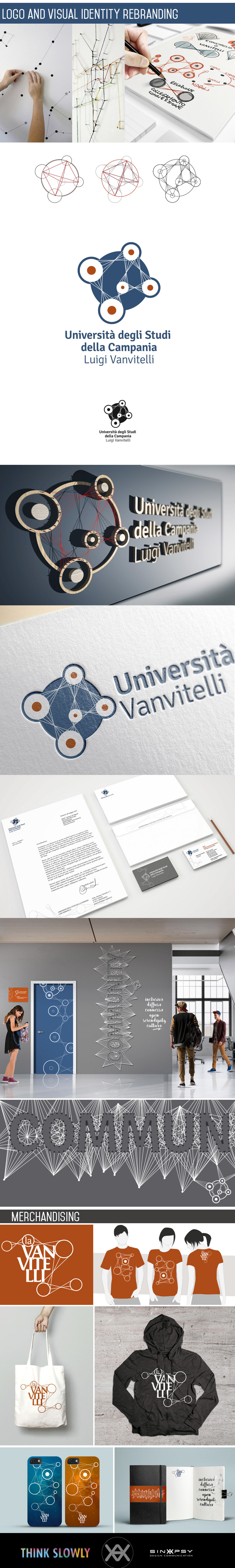
The graphic proposal is based on the observation that the University Vanvitelli is related and is connected with the socio-cultural context:
- renews itself, evolves, changes, develops over time and in context
- the knowledge of the people who frequent it evolves
- helps interpersonal relationships
From these premises a graphic symbol was born based on the concept of the "relationship", consisting of five circles connected by five lines, in which the circles symbolize the spread of the Vanvitelli University and the logistic poles, within which there are departments ( knowledge), the lines represent the relationships (with the socio-cultural context) and the circle that unites the whole is the territory.
Another important objective was to make evident the modernity of the Vanvitelli University, where the dynamism and the interaction between the users influence the many aspects of people's lives.
The designed symbol becomes part of a graphic system, placing itself at the center but only in a symbolic way, and from which the connections and relations with other entities depart.
The lines are therefore fundamental graphic elements translated also outside the logotype and that create a graphic mesh that can be modified according to the context and the degree of communication.